

Mixing Warm and Cool Material Tones
Balancing warm and cool material tones has become an essential strategy in modern interior design. Rather than committing entirely to one temperature family, designers increasingly combine contrasting tones to create depth, dimension, and visual harmony. When executed thoughtfully, this approach prevents spaces from feeling either too sterile or overly heavy. In renovation projects, understanding how to mix warm and cool materials effectively can transform the character of a home.
Understanding Warm and Cool Tones
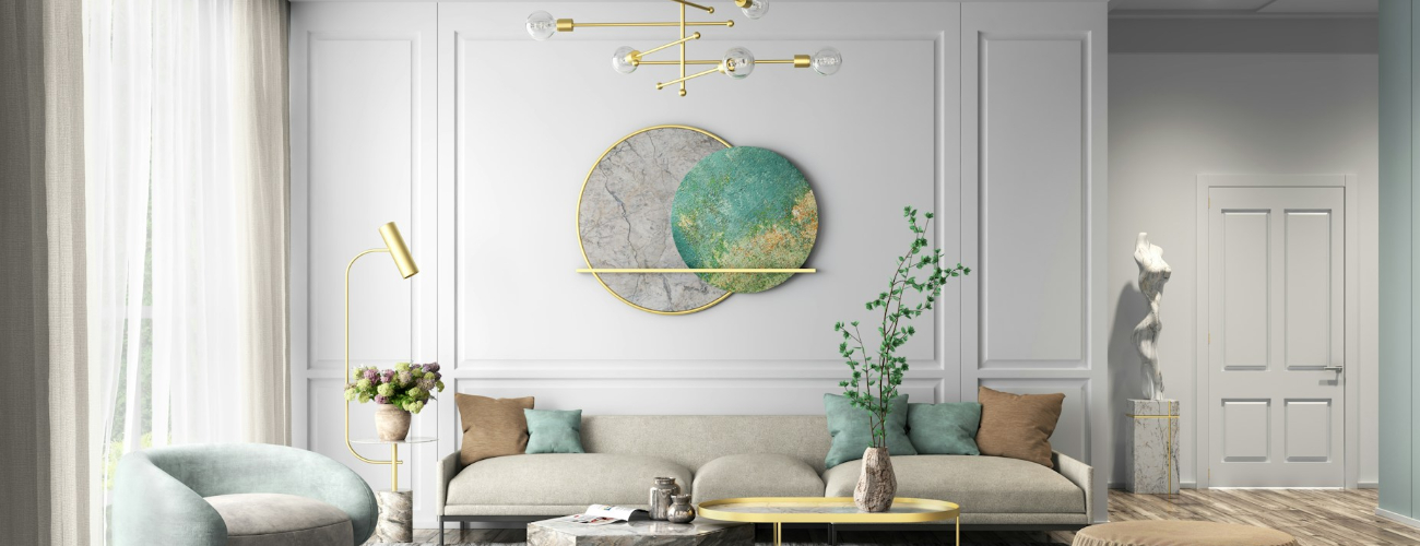
Warm tones typically include materials with red, orange, or yellow undertones. Natural woods such as oak, walnut, and cherry fall into this category, as do brass fixtures and earthy stone surfaces. These elements create comfort and a sense of coziness.
Cool tones, on the other hand, contain blue, gray, or green undertones. Materials such as concrete, stainless steel, marble with gray veining, and matte black finishes are often considered cool. They contribute to a clean, contemporary aesthetic.
Individually, each temperature offers distinct advantages. However, relying exclusively on one can make a room feel unbalanced. A fully cool palette may appear clinical, while an entirely warm palette can feel dated or visually dense.
Creating Intentional Contrast
The key to mixing tones is intentional contrast. Instead of randomly combining materials, designers typically establish a dominant temperature and then introduce complementary accents.
For example, a kitchen with cool gray cabinetry and quartz countertops can be softened with warm wood flooring or brass hardware. Conversely, a living room with warm wood paneling can be refreshed with cool-toned textiles, stone surfaces, or black metal lighting fixtures.
This contrast enhances visual interest while maintaining cohesion. It prevents monotony and highlights the unique qualities of each material.
Using Neutral Elements as a Bridge
Neutral elements often act as a transition between warm and cool tones. White, soft beige, and muted taupe can balance opposing temperatures without competing for attention. In renovation planning, selecting a neutral wall color or flooring base can simplify the integration of varied materials.
Textiles also serve as effective bridges. Upholstery, rugs, and curtains can subtly combine both warm and cool hues, blending the palette into a unified composition.
Balancing Metal Finishes
Metal finishes play a significant role in tone mixing. Brass and gold are typically warm, while chrome and stainless steel are cool. Matte black can function as a neutral connector between the two.
Rather than limiting a space to a single metal finish, combining two complementary options often produces a more layered result. The key is consistency in distribution—repeating each finish in at least two areas to avoid a fragmented appearance.
Lighting and Tone Perception
Lighting significantly influences how warm and cool materials are perceived. Warm lighting can intensify the richness of wood tones, while cooler lighting emphasizes gray or stone surfaces. During renovation, evaluating materials under different lighting conditions ensures accurate color balance.
Dimmable lighting systems provide flexibility, allowing the atmosphere to shift depending on time of day or activity.
Achieving Long-Term Balance
Mixing warm and cool tones is not a temporary trend but a design principle rooted in visual equilibrium. The goal is not to create stark contrast but to achieve harmony through thoughtful layering.
When carefully planned, the combination of warm and cool materials produces interiors that feel dynamic yet cohesive. This balanced approach enhances depth, supports modern aesthetics, and ensures that renovated spaces remain both inviting and contemporary for years to come.